What does come to your mind when you think about the functionality of the digital product? Fancy features? Business goals? Technological capabilities?
When we put the product itself at the center of our mind, we forget about those who eventually determine the success of the design — the users. At the end of the day, you develop the product for your customers, not for an exhibition.
How can you create a design based on deep empathy towards individuals who will be using it?
How can you build a product that will never make the user think about what they need to do next?
The answer is user-centered design.
In today’s article, we will shed light on how user-centered design or UCD helps to find out what users’ perspective is, how they see the product, and how they use it.
User-centered design principles
The design that pleases the user often builds with the help of UCD principles.
#1 Understand the needs of a user
Vestergaard, a global health company won the “Design to Improve Life” award for the LifeStraw plastic water filter solution that changes contaminated water into clean drinking water. People who don’t have access to safe water can drink through the straw and be protected against bacteria and other parasites.
The product created with the users in mind now protects millions of kids in the areas without access to healthy water. It’s a great example of the user-centered design approach.
Identify the product users, what they will use your app or software for, and the conditions under which they will use it. Observe people’s lives, get compassionate about their hopes and desires, and discover what’s will be feasible and viable.
Pro tip: speak with people who will be using your product personally, or in a group. It’s the best way to get to know their desires and aspirations.
#2 Incorporate users’ feedback and define requirements and design
Knowing what’s most desirable is only one side of the coin. After determining the needs, start to research how to incorporate user feedback in the design plan and make it real.
#3 Get an evaluation from your users with usability testing
There have been many techniques developed by UX researchers over the years to test and validate product design. Some of the most popular are guerilla testing, lab usability testing, and contextual inquiry.
Guerilla testing. This form of usability testing means going somewhere public like a coffee shop to ask random people about your design or prototype.
Lab usability testing is a type of testing that is conducted in laboratories and supervised by a moderator, who is looking to obtain feedback from live users and facilitate test participants through tasks in real-time.
Contextual inquiry is similar to an interview method that helps a product team receive information from test participants who are first asked a set of questions about their experience with a product and then observed and questioned regarding the experience in their own environments.
#4 Iterative design process.
As the user-centered design is the mindset of placing the person in the first place, the product team should constantly work on improving the user experience. By introducing changes step by step you will better understand your target audience.
User-centered design (UCD) benefits
The benefits of user-centered web design have clearly explained why should you design with the end-user in mind.
- It allows you to deeper understand the problem users want to solve, and boost competitiveness.
- It allows quick testing and validation of story concepts before it is completely developed.
- It gives a crystal clear project vision.
- It allows creating a product that will be engaging for the customers, thus increasing your sales.
- It has a better foundation for estimation.
- It builds positive user experiences.
- It reduces project failures and saves your time and money.
Examples of successful user-centered design
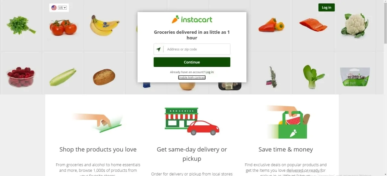
Interface adaptation for the visually impaired people
To be user-friendly for visually impaired people, Instacart, an online grocery delivery platform, created the well defined and contrasting product showcase is well defined for those who are visually impaired. Designers thought about people of every sort and selected color to befit their visual preferences. For instance, when you add an item to the delivery list, you can instantly select the quantity in the main interface, without getting back to the cart option. Moreover, when you register you can choose a website to be more or less contrasting depending on your eye perception.


