Contact us
9 minutes

It comes as no surprise that the healthcare industry wasn’t among the digital transformation pioneers. A bunch of government regulations, security concerns, and bureaucracy made it stand still whereas other industries were actively adopting innovations.

Though the healthcare market became overcrowded in a few years, investments increased, and ambitious startups started gaining patients’ and healthcare organizations’ trust.

How did it happen? Healthcare providers understood that by leveraging digital they could offer better customer service, enhance the work of their personnel, expand their reach, and as a result margins.

And the first step they made was building an excellent medical practice website design.

Medical Website Design Tips

# Intuitive Navigation Structure

Website taxonomy, aka navigational structure, stands for the way in which companies organize their website so that users can easily and intuitively navigate it.

The main principle of intuitive navigation sounds very simple: users must quickly understand the website’s structure. Persistent and logical organization of information should help them easily find the required pieces of information. Sounds very simple, doesn’t it?

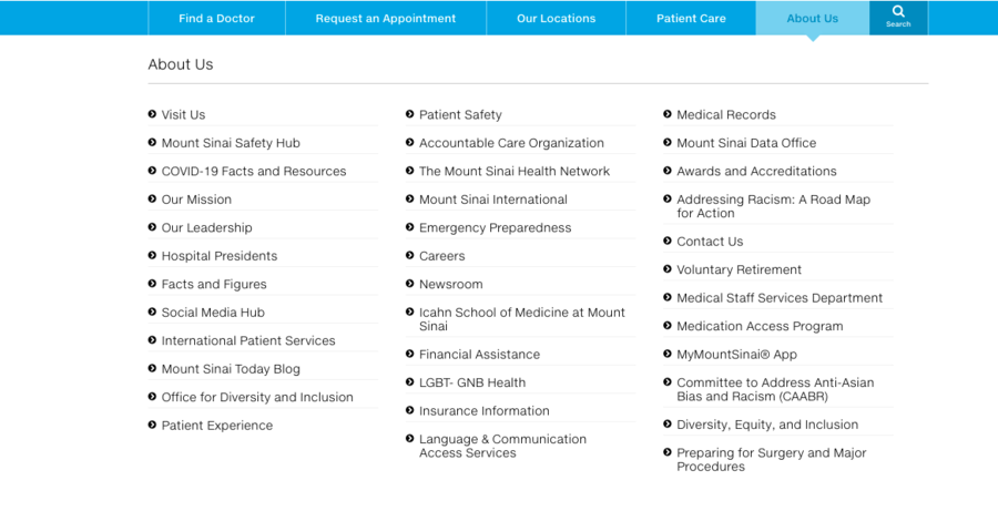
Source: MountSinai

Mount Sinai has a very overloaded website with unstructured data on the main page. To find contact information, for example, you need to go to the “about us” section and read three columns of different options.

The structure of the main page is also difficult to navigate. You have services and hospitals in the same carousel and just down a carousel with a blog.

# Functional and Simple Search

Think of Google. You get the website you were looking for as a result of typing just a few keywords. Your input is interpreted and you receive not only the most relevant pages for your inquiry but also the most authoritative.

Your website search should be simple and quality. If users can’t find what they need, they open your competitors’ websites. So what should the medical website design include to make it helpful for users?

  1. A search button or field should be visible on every page, don’t make users search for it. A good idea is also to add a predictive text input mode that allows users to type faster and gives hints in medical terms they might not know well.
  2. Enable users to group the search results into categories, for example, “Epidemiology”, “Dermatology”, etc.
  3. Add a sort function, for example, the most viewed result, the most recent, etc.
  4. Breadcrumb allows users to see where the current page is in relation to the website’s hierarchy.
  5. Add a short description to the search results that include the search terms.
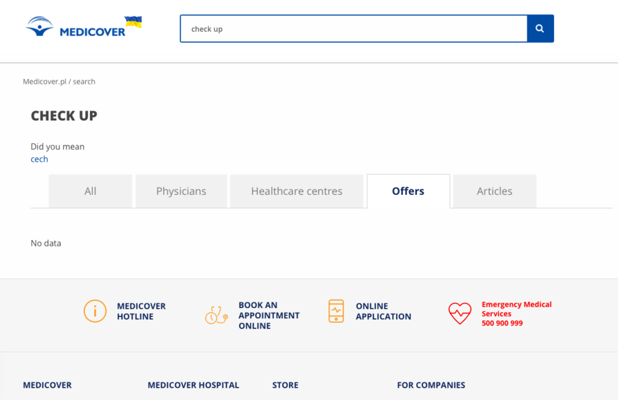
Source: Medicover

Medicover Poland offers a search field if you switch language to English. After typing in “check-up”, the search shows categorized results which is very convenient though shows ANY relevant offers the same if you type in “health examination”.

If you want to search in Polish, you’ll have an option to search for a doctor and city in a field which is again not very convenient.

# High Quality and Strong Imagery

Any website that has visual content will outperform a website that doesn’t have it. According to eMarketer, posts on Facebook from brands that included images earned 87% of all engagements.

In terms of medical website design, using high-quality imagery helps you not only showcase the quality of services that you offer but also “humanize” your website by including pictures of your doctors, for example, so that patients know who they are booking a visit with.

Three main principles of visual content for healthcare website design:

  1. Use original photos and videos instead of stock images to show off your practice.
  2. Stick to a limited color palette, try to use soothing light colors that are associated with wellbeing and health like aquatic colors, for example.
  3. Leave some empty spaces for your website not to be too busy and for users’ eyes to rest. If you want to use a number of photos, think about the image carousel. It will make your design look clean.
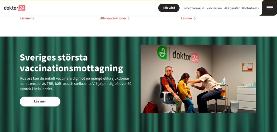
Source: Doktor 24

Doktor 24 uses high-quality, original photography paired with informative texts showing their practice and images of their doctors. As you scroll down, you see white space as well as animated “micro-interactions”, and blog pictures all in the same shades.

# Fast Page Load Speed

A few years ago, it was normal to have a slow website. Today, users leave your webpage in 15 seconds if it gets clunky or they simply don’t like it. In the digital world, your website is a car that drives your users to the community of your customers. If it’s slow, they will take another one.

How to Optimize Your Website Speed?

  1. Optimize the images. The total number of images and videos and their size are two main factors that have an impact on the loading time of your website. How can you achieve the smallest size with the best quality images?
  2. Use WebP format images that are 30% smaller than JPEG and 25% smaller than PNG. The tools are Squoosh and Online-Convert.com or command-line tools to convert other formats to WebP. Please mind, that this format isn’t supported by Safari and IOS Safari;
  3. Compress the images. A variety of image editing tools such as Adobe Photoshop, Affinity Photo, On1 Photo, etc., have built-in tools for compression;
  4. Reduce file dimensions. Photos imported for the camera have high resolution and file dimensions. You can reduce it with image editing software.
  5.  Optimize the videos. Animated WebP or HTML5 video tag is lighter and gives you better control over your website’s video player compared to slow videos and heavy GIFs. HTML5 video tag works only with such file formats: MP4, OGG, and WebM. You can convert online with the help of HTML5 Video Converter, Handbrake, Converter Point, and Freemake Video Converter.
  6. Use Web Caching. Web caching significantly speeds up your website and reduces server lag. Instead of seeing an original file, users are provided with a cached version of an image or webpage the copy of which was temporarily stored when the user requested it earlier.
  7. Enable Prefetching. Prefetching allows a browser to store data that your users might request in the near future. As soon as the user needs it, it immediately appears on their screen.
  8. Compress files. You can improve site responsiveness by compressing large HTML, JS, CSS, and other code files. Some of the popular tools for file compression include Brotli and Gzip.

# ADA Compliance

In 2010, the US Department of Justice released specific guidelines for all public organizations named the Americans with Disabilities Act Standards for Accessible Design to follow so that all people with disabilities that use computers and smartphones can access their data.

If your website isn’t ADA compliant, you’re at risk of paying a solid lawsuit. It’s reported that in 2020, over 3k accessibility lawsuits were brought which is 23% more than in 2019. In 2021, the amount of ADA suits rose to 10 per day.

One of such suits was launched against Frazier v. HCA Holdings, Inc. which includes more than 100 hospitals in its portfolio and takes responsibility for their websites. The websites didn’t include alt text for images and failed to accommodate keyboard navigation (needed for users who can’t use a mouse or touchpad).

How to Make Your Website ADA Compliant?

  1. Use alt tags. Alt tags are short descriptions that people with disabilities can read to understand what the image, video, or audio file is about.
  2. Ensure contrast ratio. Images and texts on your website should be easy to comprehend for people with visual impairments.
  3. Add transcripts and subtitles for the video. It will help hearing-impaired users to check information on your website.
  4. Ensure keyboard navigation. People with mobility difficulties will be able to easily navigate your website.
  5. Provide a consistent layout. Users with cognitive disabilities find it difficult to navigate websites with poor layouts.
  6. Respond to errors. It’s vital to provide feedback whenever a user faces an error on your website and give them an alternative to solve the problem.

It’s worth mentioning that meeting ADA requirements not only protects the rights of people with disabilities and saves your practice from penalties and lawsuits, but it also opens your business to millions of people with disabilities, increases your reputation, improves your SEO rankings, and as a result, leads to more conversions.

# Patient Reviews and Testimonials

Reviews and testimonials play a decisive role in the digital experience. According to BigCommerce, 92% of users read online reviews before making a decision. One of the most widespread mistakes in medical website designs is frontloading imagery and informative texts while leaving their testimonials somewhere at the bottom of the page.

The testimonial pane should be front-and-center, highlighted in bold colors, and preferably include smiling pictures of your patients to make personal connections.

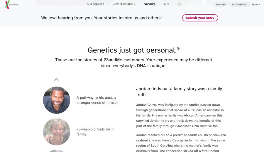
Source: 23andMe

The 23andMe website lists a lot of personal stories of their users, you can easily find them on the page and in the menu and scroll in a carousel. What is more important is that above these stories you can see a button “submit your story”. Placing such a button gives a feeling that these are the stories of real people not created by marketers and you can become one of these satisfied and smiling customers.

# Clear Contact Information

The initial purpose of building your medical website is to initiate care. And the main prerequisite of making a connection with your patients or potential patients is leaving easy-to-find contact information and regularly updating it.

What Information Should be Featured?

  1. Phone and email. Healthcare website design differs from designing websites that belong to other industries. If a user is looking for a logistics company, for example, they have time for exploring their website, reading all case studies, testimonials, service pages, and so on. In the case of medical websites, users frequently need urgent help. Therefore make sure your phone and email are visible and easy to find, you can even put them in multiple places.
  2. Online scheduling tool. Online scheduling tools are very convenient to make appointments with doctors as your users can quickly do it themselves. Provide them with a bright CTA button that says “Click here to schedule” and attach clear instructions on how to use your tool.
  3. Physical Address. Put the address of your medical facility and add an interactive map of how to get there so that your users can check the location without leaving your website.
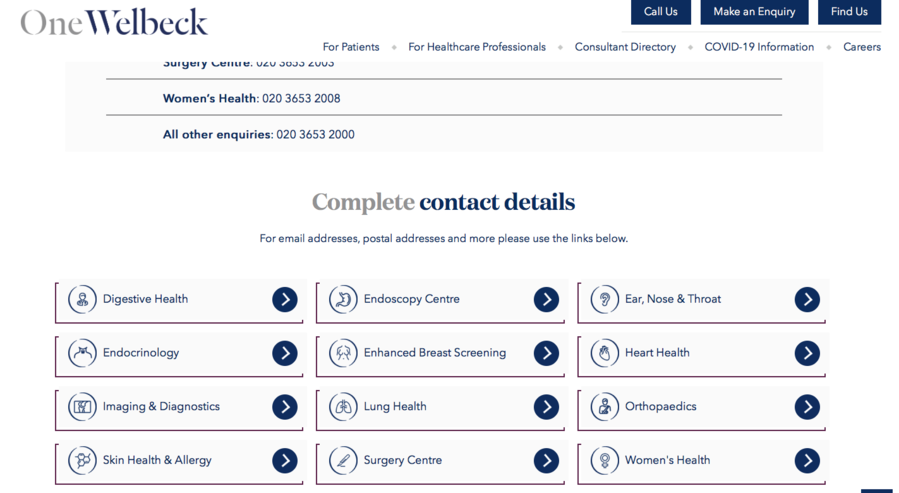
Source: OneWelbeck

One Welbeck gives three buttons on the top of the main page “call us”, “make an enquiry”, and “find us”. By choosing “call us”, users can see contact information for every department of the clinics.

# Mobile-Friendliness

55% of worldwide online visits come from mobile devices so it’s vital for healthcare providers to make sure they provide their smartphone users with the proper experience. What is more, Google de-prioritizes websites that are not mobile responsive in ranking search results.

Here are the main things to consider while building a mobile-responsive website:

  1. Clear unwanted content. Too many large texts confuse and annoy mobile users, the amount of content for desktop and mobile should be different.
  2. Use a short navigation menu. The mobile screen space is limited so make sure there aren’t too many pages and subpages.
  3. Optimize images and CSS. Images, videos, elements of custom design, and code files should be optimized to load fast.
  4. Choose readable fonts. Users won’t zoom in and out, so make sure you check it before launch.
  5. Make contact information visible. Too much scrolling to find contact information makes people leave the page.
  6. Place the CTA buttons in the right place and change their size. Your CTA button might look great on desktop but it will have a completely different look on mobile. Make sure you use medium-size buttons that are easy to spot and clickable.

# Actionable Insights

After receiving a diagnosis, frequently patients go to Google to understand what it is in simple words. And it’s not because their doctor didn’t explain to them. Doctors often use industry jargon as do medical websites.

The modern medical website design should be patient-centric. Patients don’t have the same level of knowledge in the medical industry as healthcare providers do so the interface of your website should be designed in such a way that they can easily understand what they are reading or seeing.

These medical website design tips will for sure help you to build a compelling and engaging healthcare website design.

If you don’t want yourself to get involved in the technical activities, we recommend you hire an experienced and reliable software vendor. Don’t hesitate to arrange a free consultation with our managers to discuss how you can improve your current website or build a new one from scratch.

2 people like this

This website uses cookies to ensure you get the best experience on our website.

Learn more
Thank you for getting in touch!
We'll get back to you soon.
Sending error!
Please try again later.
Thank you, your message has been sent.
Please try again later, or contact directly through email:
Format: doc, docx, rtf, txt, odt, pdf (5Mb max size)
Thank you, your message has been sent.
Please try again later, or contact directly through email: