
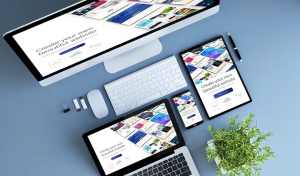
Changes are usual for an app configuration. When the user rotates the phone either vertically or horizontally, the keyboard appears. The release of the foldable smartphones, multi-window features for Android, and Catalyst (the project allowing users to run iOS apps on macOS) for iOS, has uncovered unlimited variations of screen sizes.
If you want your app design to look polished, your app is supposed to appropriately “react” to configuration changes. A lot of Flutter developers often struggle with responsive design in Flutter. In this blog, we’ll share our experience on how to make responsive app in Flutter.
But first of all,
What is Responsive Design?
Responsive design is a design and development technique allowing an application, website or system to adjust to the size of a user’s screen. It will optimize a user’s browsing experience by making a web page/application responsive for the specific device.
The concept of responsive design lies in using one set of code that adapts to different layout changes corresponding to various devices (smartphones, tablets, and desktop computers).
Responsive Design Goals:
- Larger audience. The more devices an app can be run on, the wider audience it will attract.
- Lead users to the purchase. For sure, there must be an emotional component pushing people to move intuitively on the user path. Simply speaking, it’s thinking ahead about all user stories.
- Brand awareness. A beautiful design makes your brand easy to recognize among competitors.
- Improved SEO. Responsive web design enhances search engine optimization through stronger backlinks and better bounce rates.
- Improved online and offline browsing experience. The first impression is everything, free your users from zooming and pinching their screens.
There has been a significant audience transition in favor of mobile browsing. Responsive design is the easiest way to reach users across multiple devices and ensures a smooth user experience.
During the development stage, we use the rule, called “let the mobile version go first”. This approach is convenient because it’s always easier to adjust the design created for mobile devices to a larger screen (the remaining space can be filled with content). In other words, if we have a simple thing we can turn it into a complex thing. The reverse process is more complicated.
Why Using a Responsive Design in Flutter is a Must?
A Flutter application can run on a mobile device, a tablet, or a TV screen. Mobile devices alone have a wide range of resolutions and sizes of screens. What is more, users can rotate their phones and do so frequently. Some developers decide to disable this feature and lock the application in landscape or portrait mode. Is it a good idea? It might be a solution in some cases but if you value good UX, achieving responsive design in Flutter is definitely a better idea.
Before moving to the Flutter responsive UI tutorial, let’s have a look at how iOS and Android natively handle layouts for various screen sizes.
iOS Approach
The main concepts in iOS for defining responsive layouts are:
1. Auto Layout
Auto layout constraints enable the creation of views that dynamically adjust to various size classes and positions. With the help of constraints, there is no need to manually update frames or positions, they automatically adjust your views to any size changes.
2. Size ClassesSize classes allow us to distinguish the size of devices and thus help to create adaptable layouts that look good on all sizes and orientations of iPad and iPhone so we can just update the UI.
3. UI ElementsThere are some of the UI elements that help build responsive UI on iOS, for example, UIViewController, UISplitViewController, etc.
Android Approach
The main concepts in Android for defining responsive layouts are:
- Constraint Layout
Constraint layout is a revolutionary tool that enables us to create a complete UI design with drag and drop features, enhance its performance over other layouts, manages the widgets through a single line of code, and add animations to the UI elements without much effort. However, constraint layout doesn’t solve the issues with devices with big or very little screens.
- Alternative Layouts
To solve the aforementioned issue, you can use alternative layouts in Android Studio. If you define separate layout files for various screen sizes, they will be automatically switched according to the device’s screen size.
- Fragments
Instead of separately defining the logic in the process of designing multi-pane layouts for big screen sizes, you can just extract the UI logic into distinct components.
- Vector Graphics
With the help of Vector Asset Studio in Android Studio, vector graphics can be easily created to support multiple Android screens.
Responsive Design in Flutter
Designers love magic, however, the execution process is not as easy in real life as we want it to be. If you decide to use Flutter, your designers will forget the “it’s impossible” phrase for good.
To achieve responsive UI in Flutter, it provides many widgets and classes to ease the implementation of the ideas designers may have. It’s a developer’s choice how exactly to implement them in the application. Some of them are:
- AspectRatio
- CustomSingle
- ChildLayout
- CustomMultiChildLayout
- FittedBox
- FractionallySizedBox
- LayoutBuilder
- MediaQuery
- MediaQueryData
- OrientationBuilder
So, how to make responsive design in Flutter for your users to get the most from Flutter responsive screen?


