Data visualization is an essential part of data analysis and communication. Visually appealing and informative plots make it easier to understand complex data patterns and convey the findings in an effective way.
Being a popular language for data analysis and visualization, Python offers a range of options to choose from.
Each of Python visualization libraries has a set of features, advantages, and disadvantages. Of course, the best way to learn about different technologies and visualization libraries in Python is practice. However, to make an informed decision it’s also important to understand the pros and cons of each, as different visualization tools in Python have different syntaxes and semantics.
In this blog, we’ll cover the 7 most popular Python libraries for visualization.
Reasons to Use Python For Data Visualization
Python has become a go-to language in data science. There are multiple reasons why it’s so often chosen for data analysis and beautiful data visualization. Some of them are:
- Unlike Excel, for example, which is also frequently used for data visualization, Python can handle large and multiple datasets very quickly.
- It gives great data connectivity when working with cloud-based data.
- Python offers improved productivity which allows business stakeholders to make data-driven decisions.
- Python's syntax is clear, readable, and beginner-friendly, making it easy for data scientists, analysts, and researchers to learn and use.
- It has a vast and mature ecosystem of data visualization libraries
- Python is a versatile language that can be used for various tasks in data analysis, machine learning, and web development.
How to Use Python for Data Visualization
Python implementation for data visualization involves leveraging various libraries and tools to create informative and visually appealing representations of data. Here's a step-by-step guide to getting started with data visualization in Python:
1. Install Necessary Libraries
Make sure you have the required visualization packages in Python installed. Common libraries include:
- Matplotlib
- Seaborn
- Plotly
- Bokeh
- Altair
- Holoviews
In your Python script or Jupyter Notebook, import the required data visualization libraries. This allows you to access their functions and features.
3. Load Your DataLoad your dataset into a Pandas DataFrame or another suitable data structure. Ensure your data is in a format compatible with the chosen visualization library.
4. Choose a Library Based on the Use Case
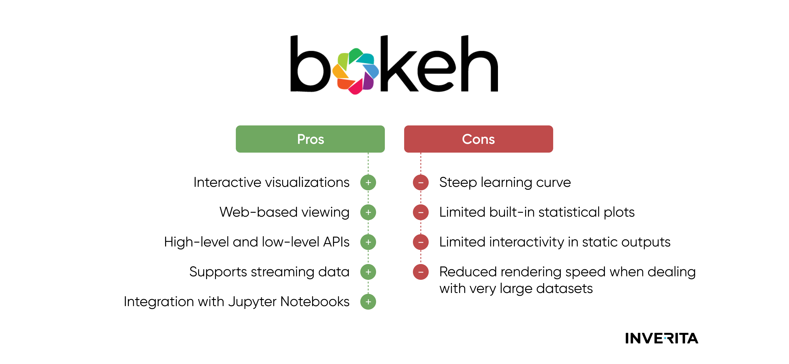
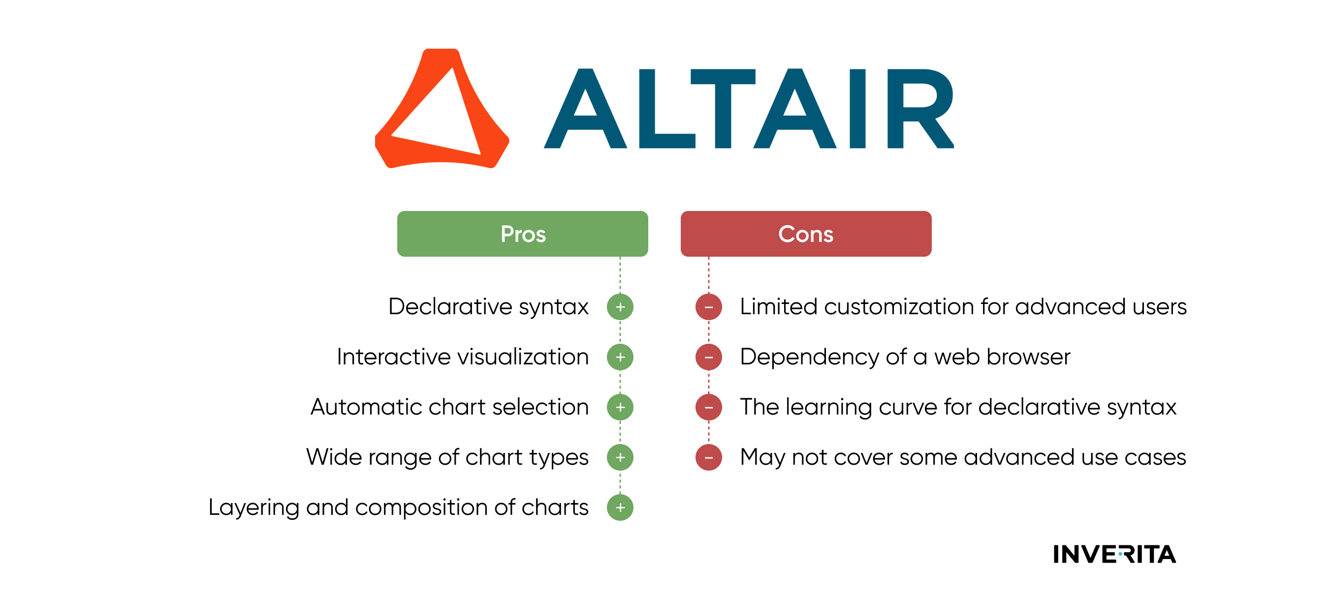
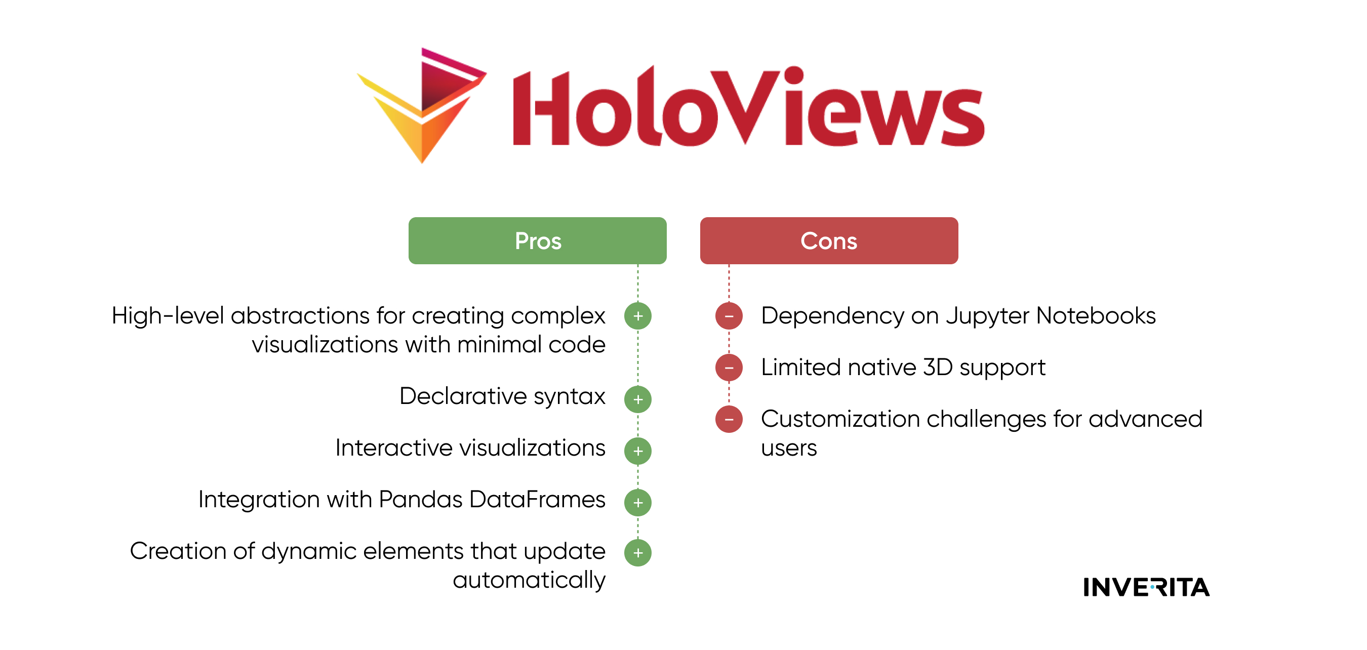
Depending on your visualization needs, choose the appropriate library. For basic plots and customization, Matplotlib and Seaborn are widely used. For interactivity, consider Plotly or Bokeh. Altair and Holoviews offer high-level abstractions for concise visualizations.
5. Create Simple PlotsStart with simple plots like scatter plots, histograms, or bar charts. Use Matplotlib and Seaborn for quick and static visualization of plots.
6. Explore InteractivityIf interactivity is crucial, experiment with Plotly or Bokeh. These libraries allow users to create dynamic plots with zooming, panning, and tooltips.
7. Create Interactive Dashboards with Dash
To create interactive dashboards, explore Dash by Plotly. Dash allows you to build interactive web applications with data visualizations.
8. Experiment with Declarative SyntaxAltair and Holoviews use a declarative syntax, allowing users to express visualizations concisely. Experiment with these libraries for simplicity and ease of use.
9. Save and ShareSave your visualizations as images or interactive HTML files for sharing or embedding in presentations, reports, or websites.
10. Experiment and CustomizeExperiment with different libraries and visualization types to find the most suitable for your data. Customize your plots using available options and documentation.
Now, let’s examine each visualization Python library individually.
Top 7 Data Visualization Libraries for Python
Matplotlib
Matplotlib facilitates the creation of 2D array plots. It utilizes the NumPy library, written in Python, and is compatible with Python and IPython shells, as well as Jupyter notebooks and web application servers. It allows users to explore trends, behavioral patterns, and correlations through scatter, line, bar, and histogram plots, among others.
Main Features of Matplotlib
- Matplotlib supports a variety of plot types, including line plots, scatter plots, bar plots, histogram plots, pie charts, 3-D charts, and more.
- It has great customization options for plots. Users can control the appearance of plot elements, such as colors, markers, line styles, and labels.
- Matplotlib integrates with Jupyter Notebooks and NumPy, another popular Python library for numerical computing.
- Supports the creation of animated visualizations.
- Supports multiple backends, allowing users to choose the appropriate backend for their specific use case. Backends include interactive backends for user interfaces and non-interactive backends for saving plots as image files.
- The Matplotlib gallery provides a collection of example plots and code snippets, serving as a valuable resource for users to learn and adapt code for their specific needs.
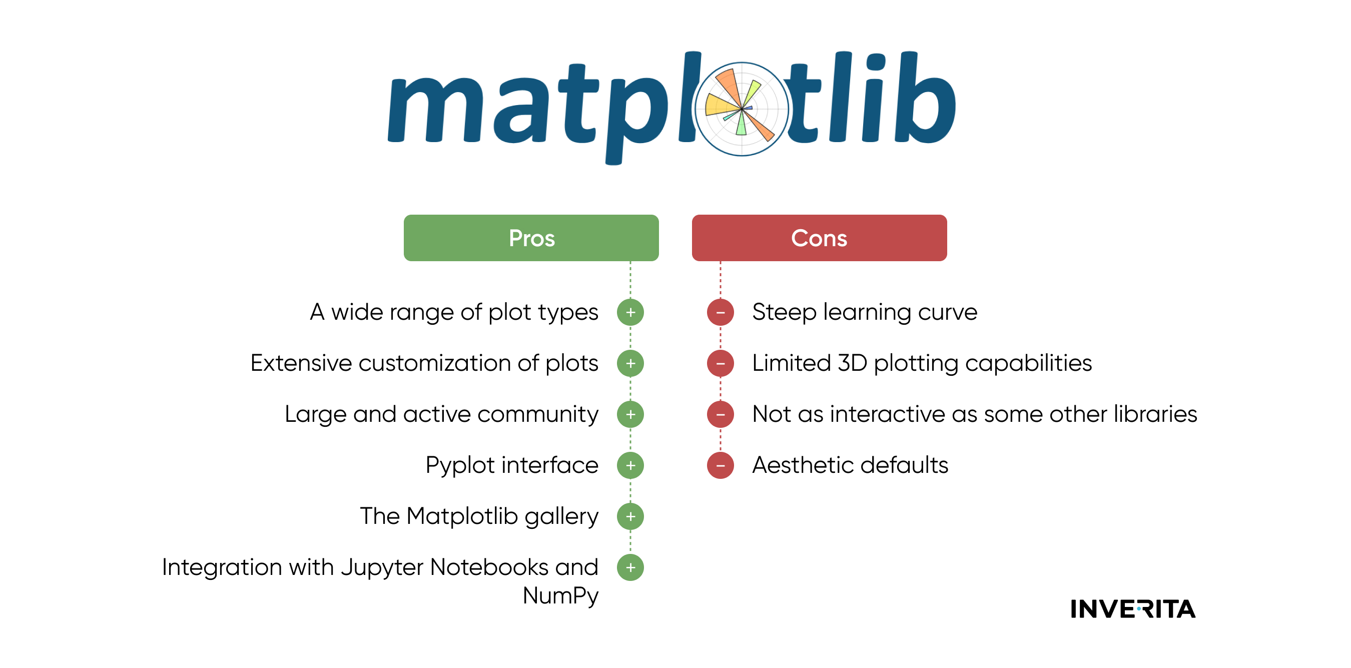
Matplotlib Pros and Cons

