Contact us
9 minutes read

A shoddy, knock-off experience never brings conversions. Confusion kills usability. Slow websites deter users from visiting them ever again. These are facts as old as hills but still, there are so many same mistakes when it comes to UX design. How to ensure enjoyable experiences for your users without compromising on the website's search rankings? We collected the 10 most common mistakes that lead to poor user experience. Let’s dive in!

And remember, if you want the visitors to come back, the experience you offer them should be stellar.


The Importance of Excellent UX Design

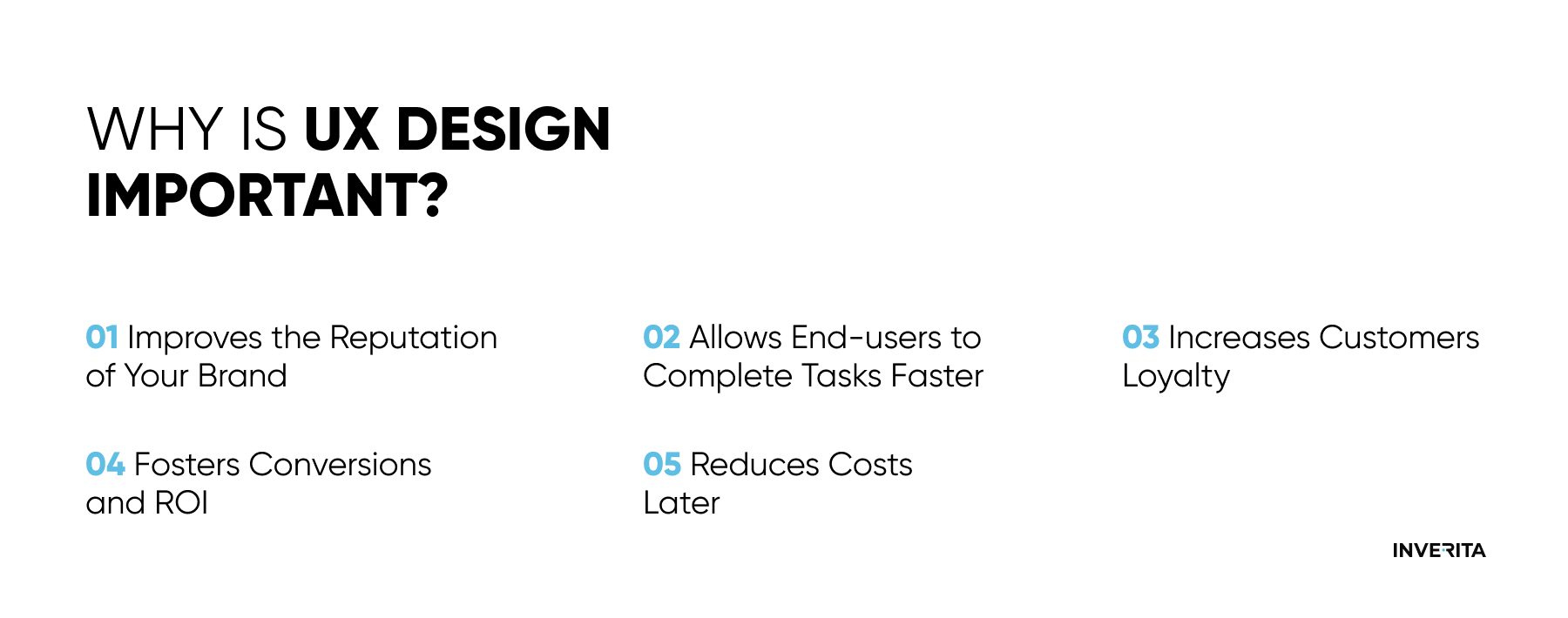
UX design shapes how people perceive your product. It doesn’t only give the first impression but accompanies the user throughout their entire journey on your website, app, etc. Good and concise UX design ensures that users have a great, easy, and enjoyable time discovering your product. While making a lot of UX design errors leads to lost customers and opportunities.

Our experience shows that to win the competition, well-thought UX design is extremely important as it simplifies the workflows of various user personas, increases customer lifecycle efficiency, and remains relevant over time.

why is ux design important

Top 10 Common UX Design Mistakes to Avoid


#1 Blindly Copying the Work of Close Competitors

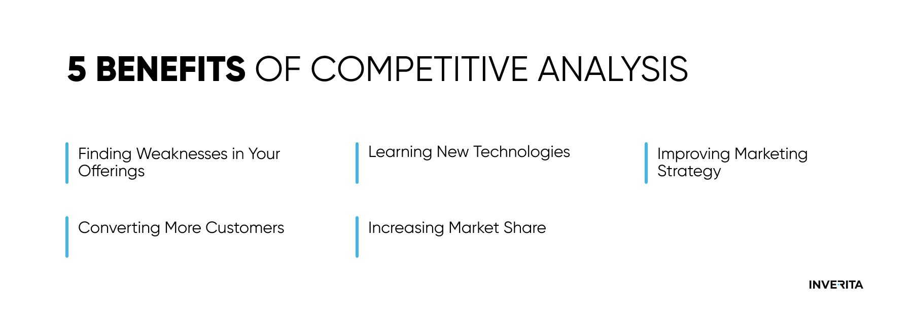
Can you achieve growth by simply copying your competitors? No, this is a very wrong growth strategy. Another thing is to conduct a thorough competitor analysis. Studying competitor sites is a valuable source of information to get inspired, and learn some standard practices, and approaches to follow and to avoid, but never to faithfully recreate someone’s website. How to carry out competitor analysis properly to avoid UX design mistakes? Here are the main steps to take:


  1. Analyzing different websites in-depth takes too much time. Focus on the problem areas of the website you are working on.
  2. Find some less obvious (indirect) competitors to check their websites too.
  3. Look for commonalities among competitors, consider the tone, useful and bad features, loading time, reviews, design, etc.
  4. Create a small summary of your findings to identify design opportunities.
  5. Create a presentation with interesting findings backed up with evidence.
competitive analysis

#2 Slow Page Load Speed

Not so long ago people were used to waiting for a page to get loaded. Today, they leave in 15 seconds if the webpage gets clunky or they simply don’t like it. 

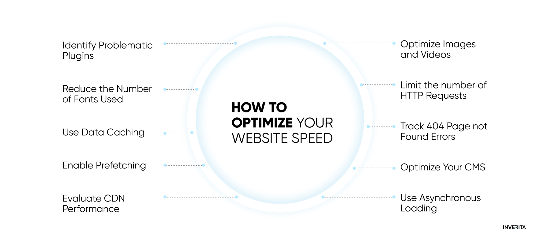
So, How to Optimize Your Website Speed?


  1. First of all, optimize the images. The number of images on your website and their size are two of the most important factors that decide the loading time. There are three main variants of how to preserve their quality at a small size:
- WebP format makes images 30% smaller than JPEG and 25% smaller than PNG. You can use command-line tools, Squoosh, and Online-Convert.com to convert the images. Though Safari and iOS Safari doesn’t support WebP;

- Compress the images with editing tools such as Adobe Photoshop, Affinity Photo, On1 Photo, etc.

- Reduce file dimensions of high-resolution images imported from a camera. You can do it with the help of image editing software.

2. Secondly, optimize the videos. With an animated and lighter WebP or HTML5 video tag, you get better control over the video player than you can get with heavy GIFs and slow videos. You can convert into HTML5 with the help of these tools: HTML5 Video Converter, Handbrake, Converter Point, and Freemake Video Converter.

3. Reduce server lag and speed up your website through web caching. Web caching uploads a cached version of your webpage or image that the user requested earlier instead of loading the original file;

4. Compress large HTML, JS, and CSS files to improve the responsiveness of your site. Brotli and Gzip are some of the tools you can use for this purpose.
Of course, there are more options on how you can optimize your website speed. If you have experienced developers by your side, they will help you to choose the best optimization techniques. Here are some other options:
how to optimize website speed

#3 Bombarding Users with Pop-ups

Bombarding users with countless popups is a fail-safe way to make them leave and never come back. “Share my post, subscribe to get newsletters, download a whitepaper for free, and so on, and so on”. Popups are almost inevitable on sites that are selling something though real madness lies in how they are delivered.

3 Don'ts of Website Popups


  1. Never use popups to encourage users to share your posts. People never forget to share things online if they had an emotional reaction to them or found them useful.
  2. Don’t use more than one popup per visit. You can test different popups, customize them, and change them from time to time, but a golden rule is to use one at a time,
  3. If you got lucky enough to encourage someone to convert on your popup, don’t scare them away by asking too many questions. Just an email will be enough.

#4 Utilization of Scroll Hijacking

Scroll hijacking has become demonized by good UX and not without a reason. But first of all, what is it? Scroll hijacking is when developers and designers manipulate the scrollbar to behave differently on their website, for example, when the scroll moves automatically. Quite possibly it’s the most frustrating one among UX design mistakes. 

Websites are designed to benefit users, not hinder their experience. A standard scrolling option is something users expect to see on every page on the Internet. Don’t turn simple things into complicated ones.

For all the love Apple gets for its beautiful designs, its Mac Pro page used some very inconvenient scrolling effects. A single-page parallax with dots that represent every section of the page and a layout that moves at a predetermined speed makes it completely user-unfriendly.

#5 A Sophisticated Search and Navigation

Let’s take the example of Google. Why is it so popular? It’s simple. You type just a few keywords, your input is interpreted, and you immediately receive the most relevant and authoritative information for your inquiry. 

Your search should work in the same way - give the users fast and quality results. If users can’t find what they need, they go to your competitors. One of the most widespread UX design mistakes, by the way most frequently noticed in eCommerce apps and websites, is too complex navigation. Instead of endless scrolling, provide your users with a logically-structured and well-organized menu, for example, simple headings and a dropdown menu.


#6 Not Including User-Generated Content

User-generated content refers to any type of online content that is related to your brand but created by someone who doesn’t represent your company. Nielsen Global Survey has found that 43% of online shoppers are more likely to buy a product that has been promoted through this type of advertising. Why? They see real pictures of people who are using your product and their unbiased feedback. Of course, no one is going to put negative reviews on their website but why not put positive reviews?

Through implementing user-generated content, the Dune London team has managed to increase their sales by 82%, so what are you waiting for?


#7 Poor Quality Imagery

It may come without saying that poor-quality imagery literally kills user experience. Including no imagery is even worse. Any application or website that has visual content will outperform the one that doesn’t have it. To prove that, eMarketer carried out a study and found out that even Facebook posts that included images earned 87% of all engagements.

Three Main Principles of Visual Content Are:

  • Stick to a limited color palette;
  • Leave some empty spaces so that the page doesn’t look too busy and users’ eyes can rest.
  • Use your own photos and videos instead of stock images

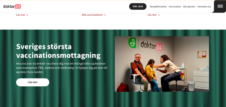
We developed the design for Doktor 24, using high-quality, original photography in pair with informative texts showing their practice and images of their doctors. As you scroll down, you see white space as well as animated “micro-interactions”, and blog pictures all in the same shades. This makes users’ eyes feel relaxed as they scroll through the page and easily find the information they need via simple website navigation.
Doktor24
Source: Doktor24

#8 Ignoring Responsive Design

Responsive design is not a trend but a must, unfortunately, still sometimes ignored. Responsive design allows your website to quickly adapt and change depending on what device is used. A study held by Google has shown that around 90% of users switch their devices while surfing the web. Make sure your site looks great across all screen sizes, otherwise, you will isolate millions of users by making this simple mistake.


#9 Creating Multi-faceted and Complicated User Interfaces

Coming across applications with a large number of different elements such as buttons, graphics, text boxes, etc., makes it confusing and difficult to navigate for users. Does it mean that you can’t build complex UIs? For sure, not. Complex UI doesn’t mean complicated. Each interface on your app should be a maximum of three touch-points away. A multi-faceted interface will make your user experience poor and frustrating.


#10 Misleading Users with Links and Buttons

If you have a button on your website that says “Click here to learn more about our experience”, they expect to see your case studies, not a sign-up for a free trial, or something else. Another one of common UX mistakes is not checking your buttons and links from time to time. Links get expired, or you may not fill in what needed to be under that certain button. This makes your users frustrated and for you it means lost opportunities.


Using Design Thinking to Solve UX Mistakes

Design thinking may come in handy while trying to create enjoyable experiences for users. It’s an iterative process that is based on the needs, thoughts, and behavioral patterns of real users. Design thinking isn’t only about UX designers and their efforts. Stakeholders, designers, and users become collaborative partners and so-called co-designers in the design thinking process. There are five main steps to Design Thinking which are flexible, repeatable, and cyclical:

  • Empathize

A thorough user research will help you to get an understanding of the problem you are trying to solve. Empathy is crucial in getting real insights into the needs of your users.

  • Define

The gathered information now should be accumulated and analyzed to find out the problem statements. 

  • Ideate

Now you can brainstorm new ideas based on the findings of two previous stages of research.

  • Prototype

The team comes up with inexpensive and scaled-down versions of the product to test the ideas;

  • Test

The prototypes are being tested and teams can redefine some of the problems if needed.     

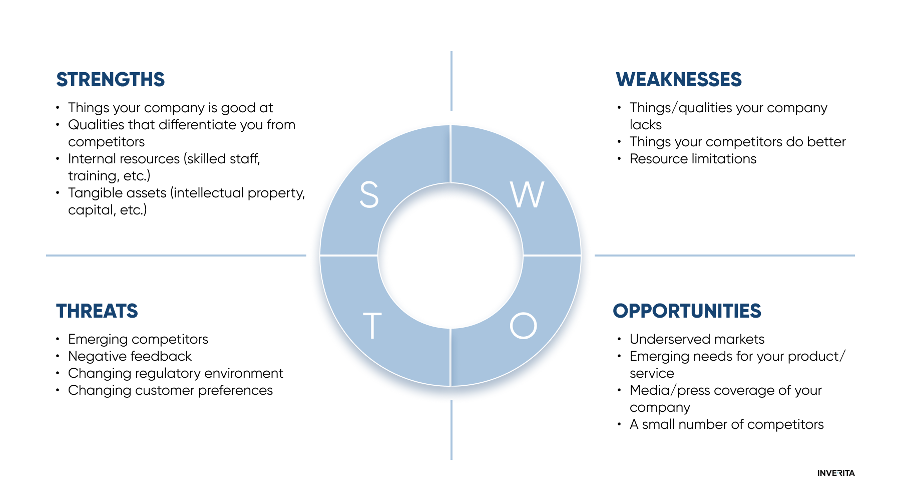
We also highly recommend conducting a thorough SWOT analysis before starting the design process.            

SOW

Conclusion

Summing up, good UX design should look beautiful, have a clear structure, and be unique, simple, and concise for users to navigate it. Everything sounds very simple, doesn’t it? Though not so easy to implement. You may have great design ideas though a lot of unexpected things may arise when you start putting them into action. Ensure you have the right people by your side to omit the most common UX mistakes and make your design user-friendly and mature.

LET'S COOPERATE
We understand that every project has different requirements, every CEO has their own vision and idea, and every industry has special development and design peculiarities. Therefore we offer a free consultation with our experts to discuss the design solutions that will be a perfect match for your product and how cooperation with inVerita may look like.
FAQs About UX Design Mistakes
What is UX design?
UX design aims at creating products that are easy and enjoyable to use. It involves the design of the whole process of acquiring and integrating the product, including various aspects of design, functioning, usability, and branding.
Why is UX design important?
The goal of UX design is to fulfill the user’s needs and increase their loyalty to your brand. Simplicity and readability of well-thought UX allow your users to complete their tasks faster, and foster conversions and ROI.
What are the most common UX design mistakes?
The most common UX mistakes include using too many pop-ups, slow page loading speed, unclear search and navigation, not following SEO guidelines, ignoring responsiveness, and creating multi-facet and complicated interfaces.
1 people like this

This website uses cookies to ensure you get the best experience on our website.

Learn more
Thank you for getting in touch!
We'll get back to you soon.
Sending error!
Please try again later.
Thank you, your message has been sent.
Please try again later, or contact directly through email:
Format: doc, docx, rtf, txt, odt, pdf (5Mb max size)
Validate the captcha
Thank you, your message has been sent.
Please try again later, or contact directly through email: